

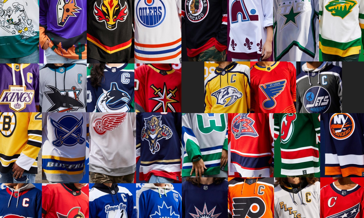
On November 16, Adidas and the NHL unveiled a "Reverse Retro" jersey for each of the 31 NHL teams. These jerseys were designed to pay homage to a jersey from each franchise's past, but with a modern twist to it. These uniforms were to act as a third, or even fourth jersey for teams, where they are only worn a handful of times throughout the season. Finally, over four months since their reveal, each team has finally gotten the chance to wear these special jerseys on the ice. Now that each jersey has been properly showcased, I decided that I want to rank all of them, 1-31.
31. Detroit Red Wings
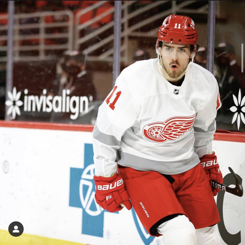
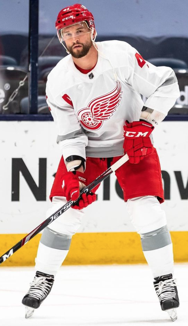
*Photos from @detriotredwings on Instagram
These jerseys just flat out suck. It seems as if there was no creativity or effort put into creating the design for this jersey what-so-ever. This jersey just looks like a practice jersey that has ugly gray striping along the bottom and the sleeves. Gray has never been in the Red Wings color scheme throughout their very long history, so I'm not sure why they felt the need to put light gray stripes on a white jersey. They tried to add some color with the red gloves and helmet, but overall, it's just a funky but boring look, and fans did not react to this jersey well at all.
30. Toronto Maple Leafs

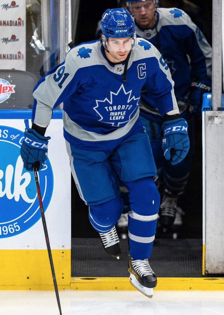
*Photos from @mapleleafs on Instagram
These jerseys are painful to look at. The strange logo on the front looks like something I would have scribbled on the back of a piece of paper when I was bored in Kindergarten, and I hate it. The gray also looks hideous, and makes it nearly impossible to see the numbers on the back of the jersey when watching the game on TV. For some reason, the use of the color gray was a big trend in the reverse retro lineup, and I am not a fan. My theory is that when Adidas was making some of these jerseys, they didn't know how to add the "modern twist" that was needed for this lineup, so they added gray and pretended that gray jerseys are cool now-a-days. Well, they're wrong. They're just flat out ugly, and this is probably the worst use of gray on any of these jerseys.
29. Dallas Stars
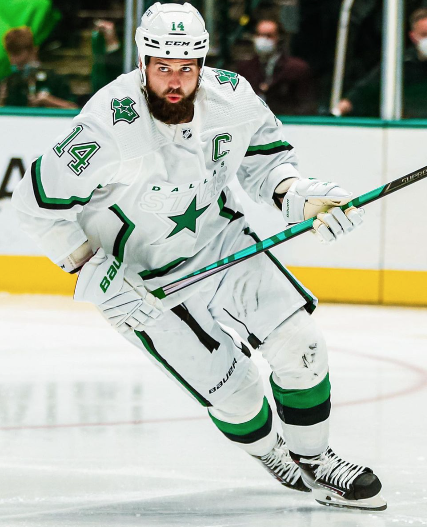
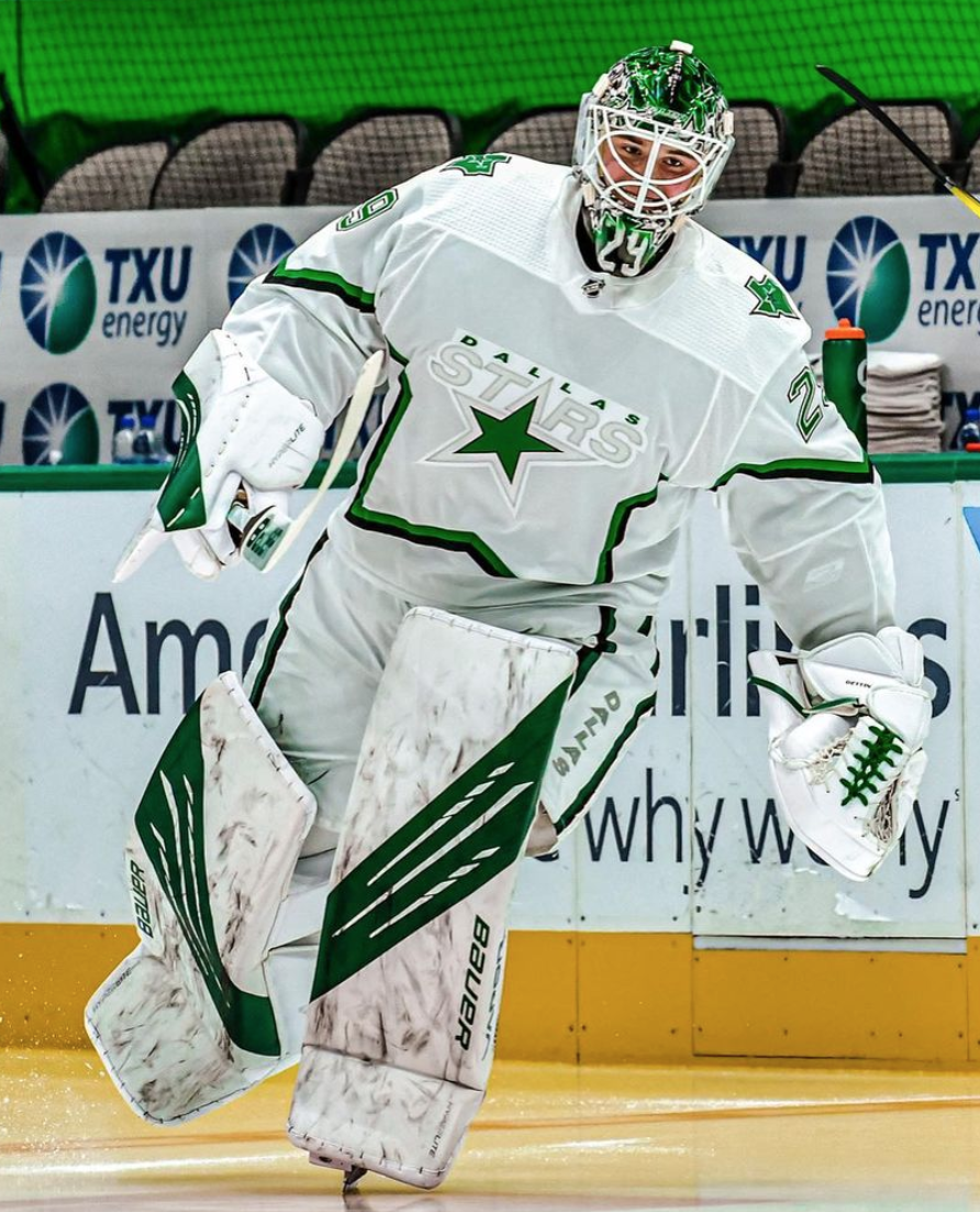
*Photos from @dallasstars on Instagram
These jerseys were so close to being perfect, yet they're so far from it. The jerseys are inspired by the original design from the 90s, and created a great starting point for the reverse retro style. However, the design team did everything wrong after figuring out which jersey to base this off of. For starters, they chose to make it white, and I don't like that some of these jerseys are white when they don't need to be. Adidas should have tried as hard as they possibly could to make these jerseys a color, so that they could be worn at home games. The white could have worked, but they didn't execute it properly. The green or black doesn't continue from the outline of the star to the edge of the jersey like it used to, and I think that without that space filled, the jersey just looks bland. Finally, the white pants and gloves are hideous. For some reason, white pants have gained popularity from Adidas in the past three years, and it's a trend they need to ditch, because it looks awful. Black or even green pants could have maybe saved this jersey, but the white makes it 10 times worse. So much potential was wasted in the making of these jerseys.
28. San Jose Sharks
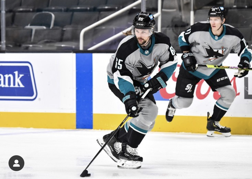
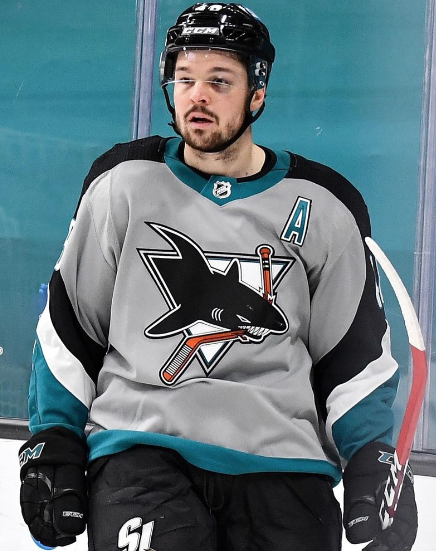
*Photos from @sanjosesharks on Instagram
As I mentioned before, I hate gray hockey jerseys. I think these jerseys had potential, and they should have just used the 25th anniversary jerseys in this position instead, but they didn't. I really don't have much else to say about these jerseys other than I don't like them, and I find them to be very ugly.
27. Boston Bruins


*Photos from @nhlbruins on Instagram
I don't have too much to say about these jerseys, except for that I don't like the yellow. In the words of Justine Gray '22, these jerseys should be "put on Sesame Street because it looks like Big Bird threw up on them." There's not enough black or white on the jersey to soften the obnoxiousness of the yellow, but even something as simple as black shoulders could have strongly helped these jerseys out.
26. Pittsburgh Penguins

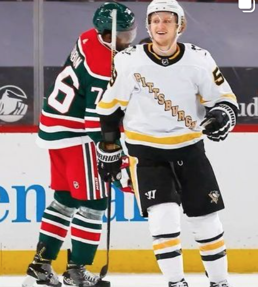
*Photos from @penguins on Instagram
Now, as a Caps fan, I usually do find myself hating everything Pittsburgh related, so I may be biased in this ranking. However, I just really can't find any way to convince myself that these jerseys are at all appealing. As I mentioned with Dallas, I don't think that any of these jerseys should be white. This jersey could have easily been black, but they decided to go with white, and I disagree with the decision. Also, I am not a fan of the "Pittsburgh" written diagonally across the front. The diagonal lettering should be reserved for the Rangers and the Rangers only, and that's just my opinion.
25. Buffalo Sabres

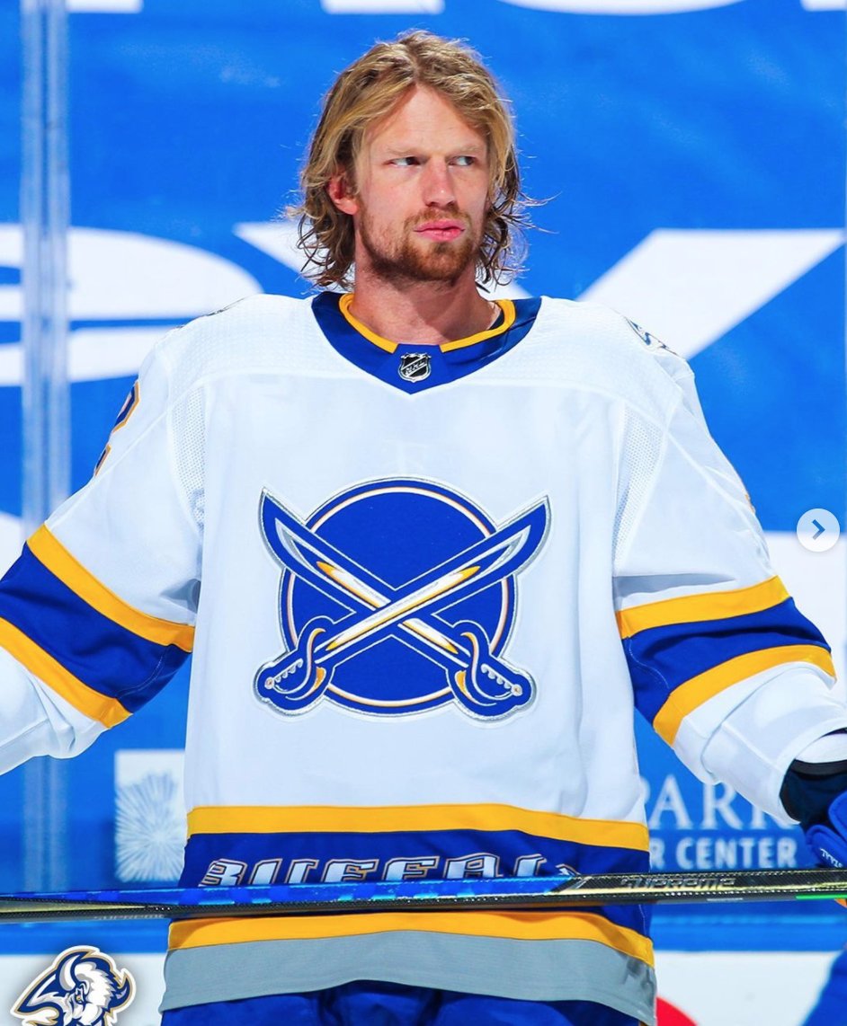
*Photos from @buffalosabres on Instagram
The only word I can think of to describe these jerseys is "meh." Not great, but not bad either. I'm not a fan of the logo, or the "Buffalo" wording on the bottom, but I like the color scheme, except for the jersey being white, and the gray at the bottom. I personally would have liked to have seen them pay homage to the jerseys they were in the 1999 Stanley Cup Final, instead of a third jersey from the 2000s, which this is based off of. Overall, not bad, but nothing special.
24. New York Islanders


*Photos from @ny_islanders on Instagram
This is not a bad looking jersey. In fact, I actually like this jersey a lot. Now, the reason why I have it ranked so low, is because there was zero effort into making these jerseys. Fans were begging for the Islanders to bring back the infamous Fisherman jerseys from the 90s. Instead they decided to take their home jerseys, and only change the royal blue to navy blue, and call it a day. If you don't know what the Islanders home jerseys look like, click here, and you will see that the reverse retro jerseys are a carbon copy of those, just with a different shade of blue. Very disappointing, but still good looking.
23. Columbus Blue Jackets

*Photos from @bluejacketsnhl on Instagram
I've struggled with this jersey. I don't know if I have serious issues with it, or if I like the overall look. I don't like that the jerseys are red, since the team is called the "blue" jackets, but that's just me being picky. The logo, which is a throwback to their original jerseys from the early 2000s, is clever, with the subtle "CBJ" hidden inside of it, but it's still funky and kind of ugly. The jersey itself also has too much white on it for my liking, and it could have looked much better without the white shoulders. I like the thought process behind these, but I'm not a huge fan of the execution. Still decent though.
22. Anaheim Ducks

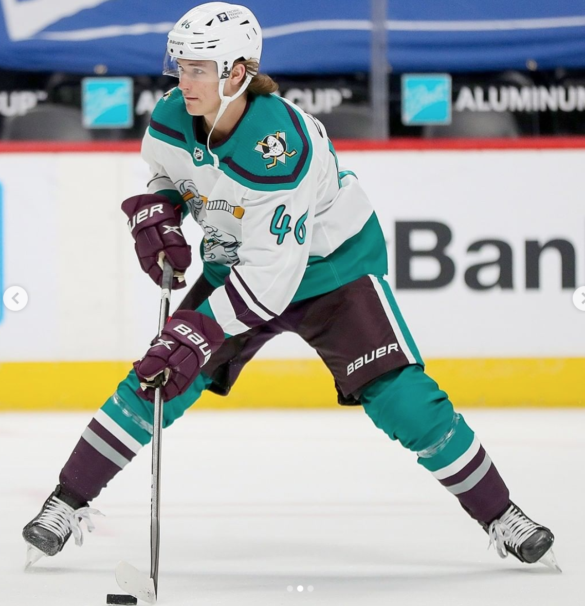
*Photos from @anaheimducks on Instagram
I am completely torn on this jersey, and it's gotten a lot of mixed reactions among fans. People either absolutely love it, or absolutely hate it. I think for a jersey that isn't worn very often, this plays that role well. I still think the design is a little bit too wacky, with the strange font and cartoon duck coming from the bottom corner of the front of the jersey. The socks not being white also threw me off a little bit, as it doesn't flow well with the primarily white jersey, and it looks bad on TV. However, I do LOVE the color scheme, and I think it's probably one of the best in sports history, and I mean that. I would have liked to see them bring back the original Mighty Ducks jersey, but they try to avoid using those at all costs, despite them being a fan favorite.
21. Vegas Golden Knights
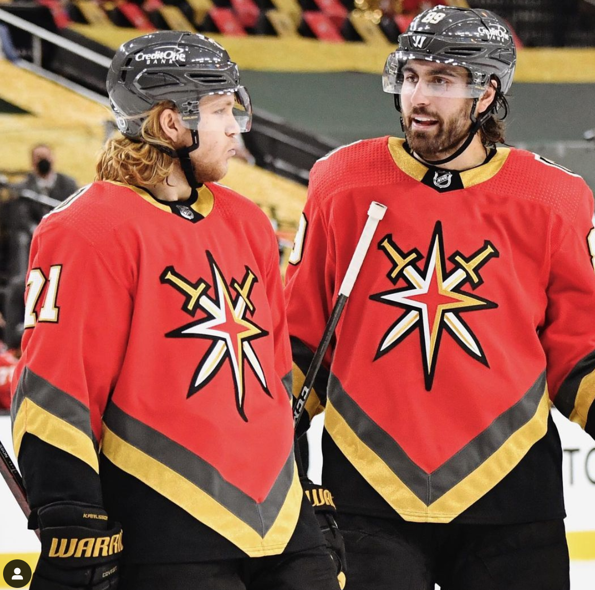
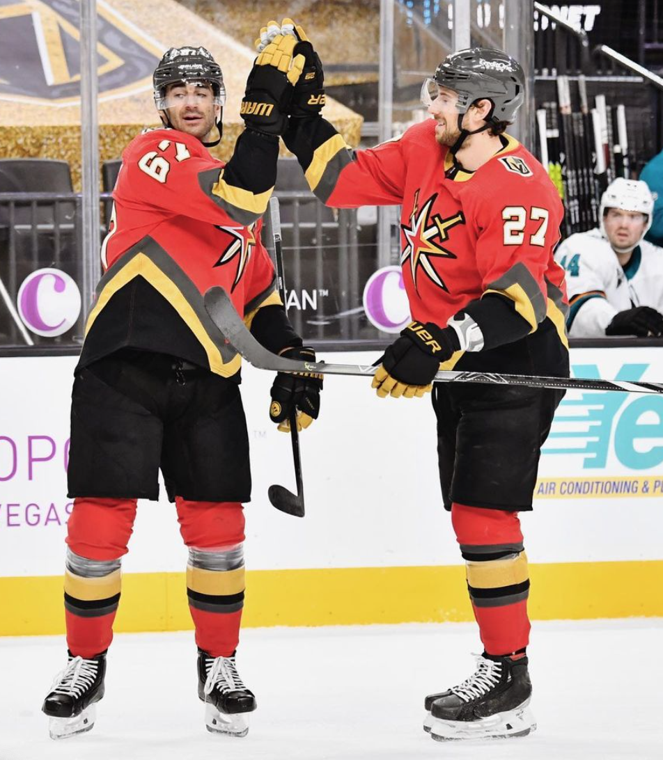
*Photos from @vegasgoldenknights on Instagram
My opinion on these changes everytime I look at them. At first, I absolutely loved these. Then after a while, I started to hate them. Now, I'm back to having more mixed thoughts about them, and am still torn. The design team for these didn't have much to work with, since the Golden Knights have only been around for three seasons. However, they decided to use the Las Vegas Thunder as inspiration. The Thunder played in the International Hockey League from 1993-1999, and were the city's only hockey team before the Knights. The decision to make these jerseys red instead of gold was an interesting one, and a decision I don't agree with. However, I am a fan of the overall design of the jersey, and I love the logo, which is a spin on the emblem found on the "Welcome to Las Vegas" sign. The red is the only reason why my thoughts on these jerseys change everyday.
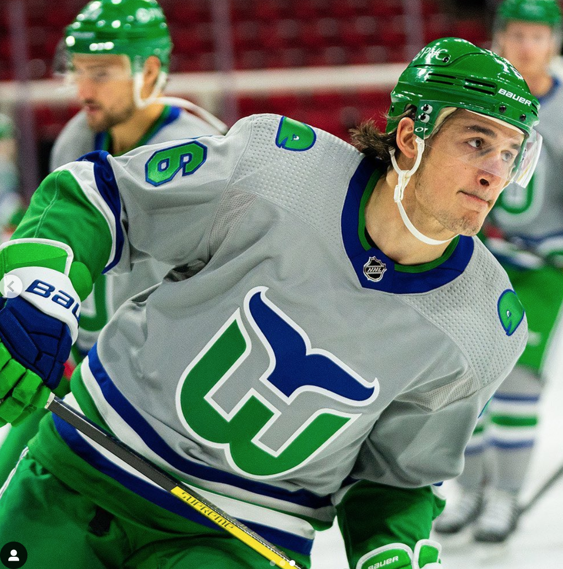
20. Vancouver Canucks

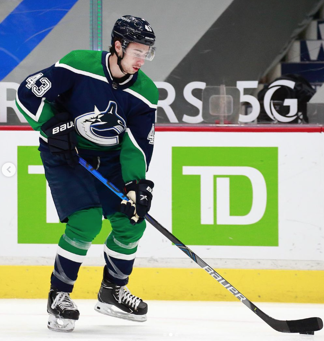
*Photos from @canucks on Instagram
This jersey just looks like a Sprite can, and I can't get over it. These jerseys pay homage to the ugly gradient look that the team sported for a few years in the 2000s, and I believe they chose the wrong jersey to base these off of. In my opinion, if the Canucks used the "skate" jersey from the 90s with the current team colors of blue and green, it would have been a home run.
19. Winnipeg Jets


*Photos from @nhljets on Instagram
I hated these at first. The gray made me so mad, and the fact that they had such a great opportunity to do an Atlanta Thrashers-esque design but didn't execute it disappointed me. However, after the team actually used these in a game, they grew on me. The jersey looks much cleaner on TV, and the gray is dark enough where it almost feels like a non-factor. The darkness of the gray and blue also helps the white pop, which looks very slick.
18. Ottawa Senators

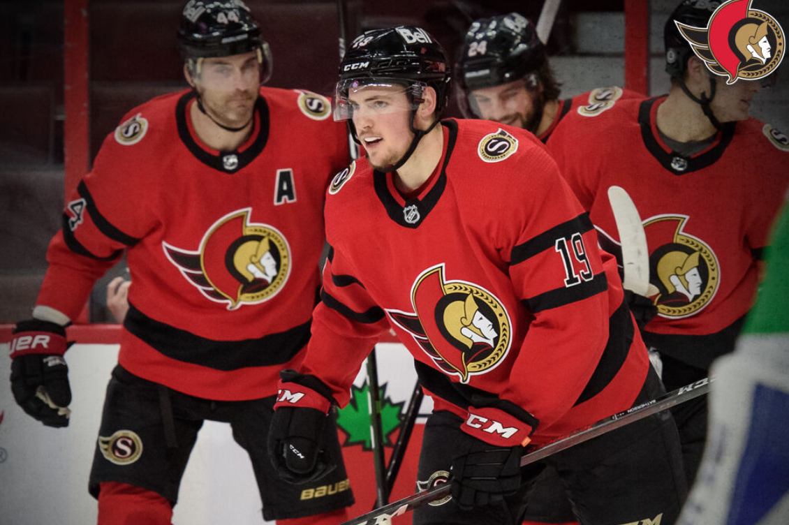
*Photos from @senators on Instagram
There's not much to say about these. It's literally the same thing as their home jerseys, but with the red and black swapped. I mean, they're good looking jerseys, but there's no creativity behind them. The reason why I didn't put this closer to where I put the Islanders, even though they had very similar concepts, is because the Senators didn't have a jersey that fans were dying to see. No one really knew what to expect from these, so no one was going to be upset with what they rolled out. I do like the overall design, and I think it's a good looking jersey.
17. Minnesota Wild
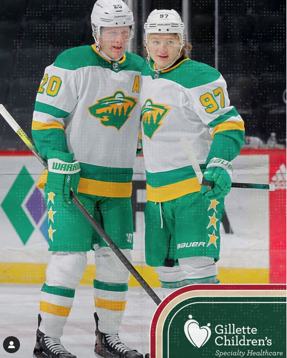
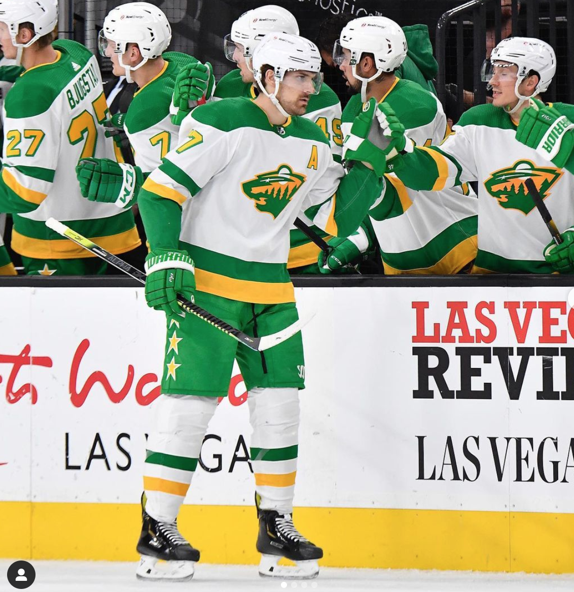
*Photos from @minnesotawild on Instagram
When it comes to the concept of these jerseys, Minnesota knocked it out of the park. This is a retro jersey with a modern twist, that pays homage to the Minnesota North Stars, but still includes the current Wild logo. Despite this, the fact that it's white is throwing me off, and the color scheme is a bit obnoxious. This jersey is what Subway would look like if it was a hockey team, and it's a little strange. The thought process behind this jersey was excellent, but the final product just doesn't look too appealing. I also find the pants to be very ugly, and I think they take a lot away from the jerseys themselves.
16. Philadelphia Flyers


*Photos from @philadelphiaflyers on Instagram
I don't have much to say about these. These are a spin on the Flyers jerseys from the 2000s, and I think it's a good look. I think the Flyers' current jerseys don't have enough black on them, and these make up for it. Overall, it's a decent look, and I like them. Not too much else to say.
15. St. Louis Blues
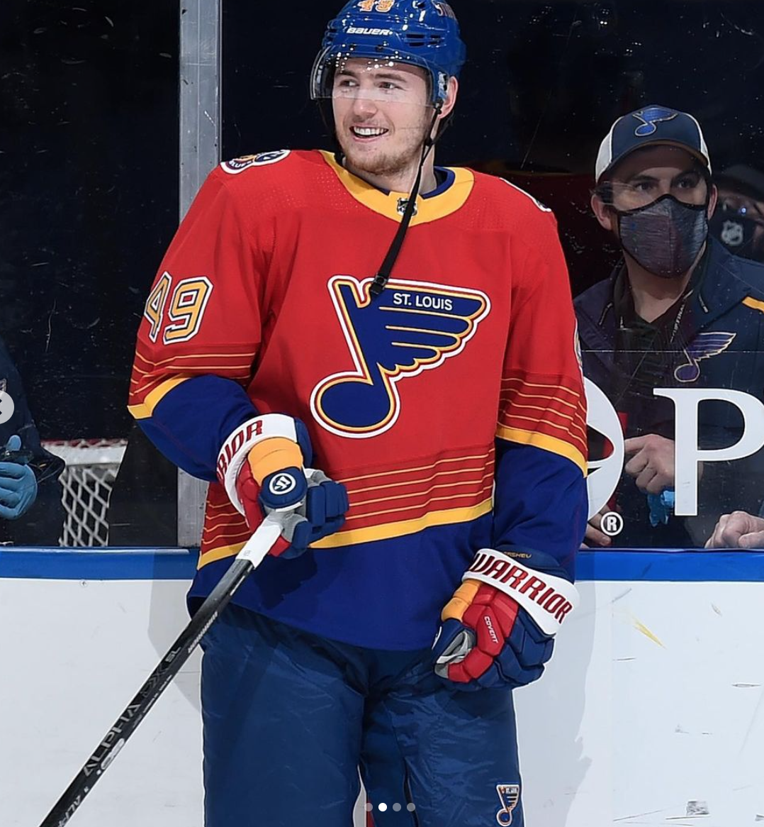

*Photos from @stlouisblues on Instagram
I feel like a good word to describe these jerseys is "loud." There is a lot going on in these. The red is very bright and eye-catching, and the gold adds to the obnoxiousness of these. It seems as if the Blues wanted to do a throwback to their 90s jerseys, but didn't know how to put the modern spin on it, so they just decided to invert the red and blue. Not a bad look, but it's a lot, and I kind of like it. You have to really like over-the-top jerseys to like these.
14. Nashville Predators

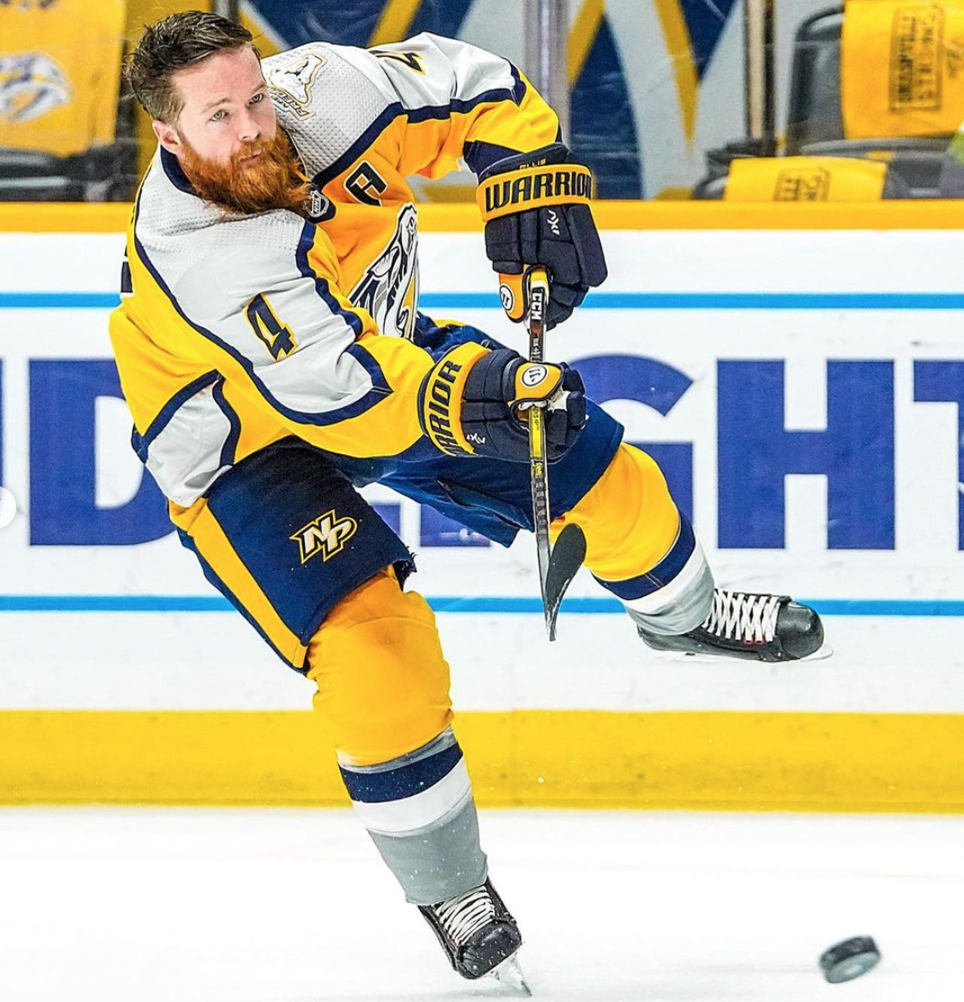
*Photos from @predsnhl on Instagram
These jerseys are maybe 1000 times better than their normal home jerseys. Adidas absolutely ruined their home and away jerseys in 2017, and the Preds should switch to these full time. I feel like the only reason why I like these so much is because of how much better they are than their current jerseys. These have character that the uniforms they were now severely lack. As I mentioned before, I am not a fan of gray on hockey jerseys. However, these get an exception, since the gray/silver used to be a prominent factor in the Preds color scheme. There's enough blue and gray on these to soften the impact of the bright yellow, which is something the current jerseys desperately need. If it's not clear enough already, I believe the Preds need to switch to these full time, starting as soon as possible.
13. Carolina Hurricanes

*Photos from @canes on Instagram
One word: gray. Why is it gray? I need someone from the Hurricanes jersey design team to properly explain to me their logic behind the decision to make these gray. They should have been either blue or green; and they would have been ranked so much higher if they went one of those routes. However, other than the hideous gray, these are really cool. I love the green and blue, and that logo is one of the best in sports history. These pay homage to the Hartford Whalers, who the Hurricanes used to be before relocating from Connecticut to Raleigh, NC in 1997. Honestly, they should have used the throwback jerseys from two seasons ago and called it a day, but I understand the Canes wanting to sell a new jersey.
12. Edmonton Oilers
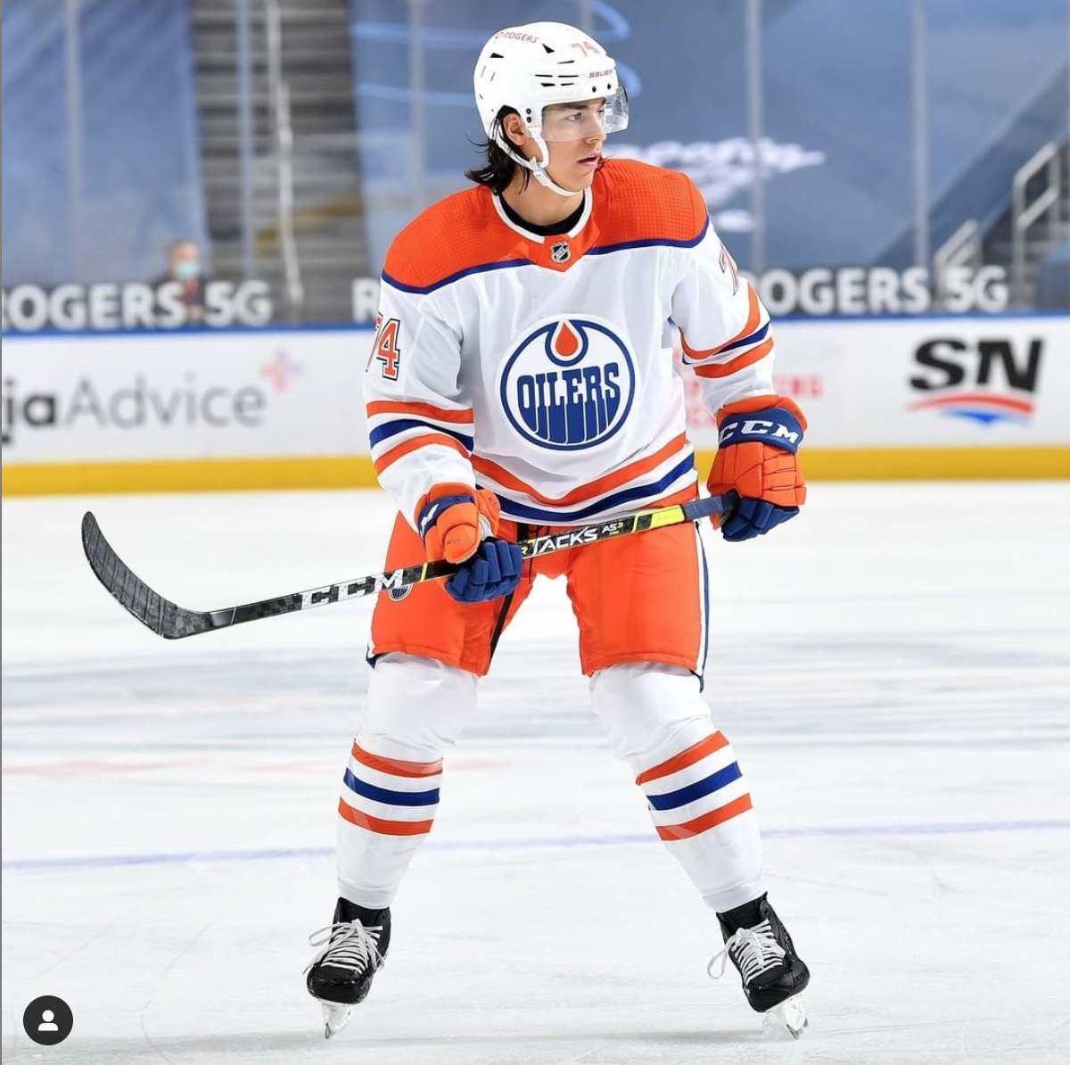

*Photos from @edmontonoilers on Instagram
I really like this uniform. I'm not a fan of the decision to make these white, but overall, I think it's a clean look. The orange pants and shoulders complement each other really well, and personally, I don't think it's too overwhelming. The gloves are a little bit much, and I think just keeping them fully blue would have looked better, but it doesn't take too much away from the whole design. I would have liked to have seen a throwback to their hideous oil drop third jerseys from the 2000s, just for some laughs, but these look so much better than those anyways.
11. Chicago Blackhawks

*Photos from @nhlblackhawks on Instagram
I'm a fan of these. I think this design was kind of a generic route to take, but the execution was done well. These are simple, but attractive jerseys. I wouldn't say they're anything special, but I'm a fan. The bright white lines separate the black and white very well, and the decision to make the names and numbers white was a good one. Overall, a very solid look, but nothing special.
10. Tampa Bay Lightning


*Photos from @tblightning on Instagram
The execution of these jerseys were flawless. They did the "reverse retro" perfectly. This is the same look they used during their Cup run in 2004, but instead of the jerseys being black, they used blue. This is because the Lightning currently use blue as their primary color, which adds the modern twist to the retro jersey. The logo has always been a bit cartoony for me, but it's not too bad. I think the Lightning should strongly consider switching to these full time.
9. Montreal Canadiens


*Photos from @canadiensmtl on Instagram
The first time I saw these jerseys, I thought they were nothing special. It's just their home jerseys, with the red and blue inverted. However, since they've worn the full uniform, they've grown on me. My only complaint would be that the pants seem like they're just barely one shade of blue lighter than the rest of the uniform, and it's throwing me off. Otherwise, this is a very cool look.
8. New Jersey Devils


*Photos from @njdevils on Instagram
Similar to Montreal, the first time I saw these jerseys, I thought they were bland. However, now that they've been worn, and have been able to show off the full uniform, I love these. From head to toe, this is a slick and clean look, which gets as close to looking too funky as you can get, without crossing a line. Overall, I'm a big fan of these, and they should keep them as third jerseys in the future.
7. Colorado Avalanche


*Photos from @coloradoavalanche on Instagram
These look great. The only thing I would change is I would have made the jerseys blue instead of white, but that's me being nit-pciky. These jerseys pay homage to the Quebec Nordiques, who the Avs used to be, before relocating from Quebec City to Colorado in 1995. Although I definitely would have preferred for these jerseys to be blue, the benefits of the white jersey is that it allows the blue numbers to pop, and it looks great. The burgundy also allows the blue to pop, and makes the design nice and clean. I'm a big fan of these, and they look even better on TV.
6. Calgary Flames
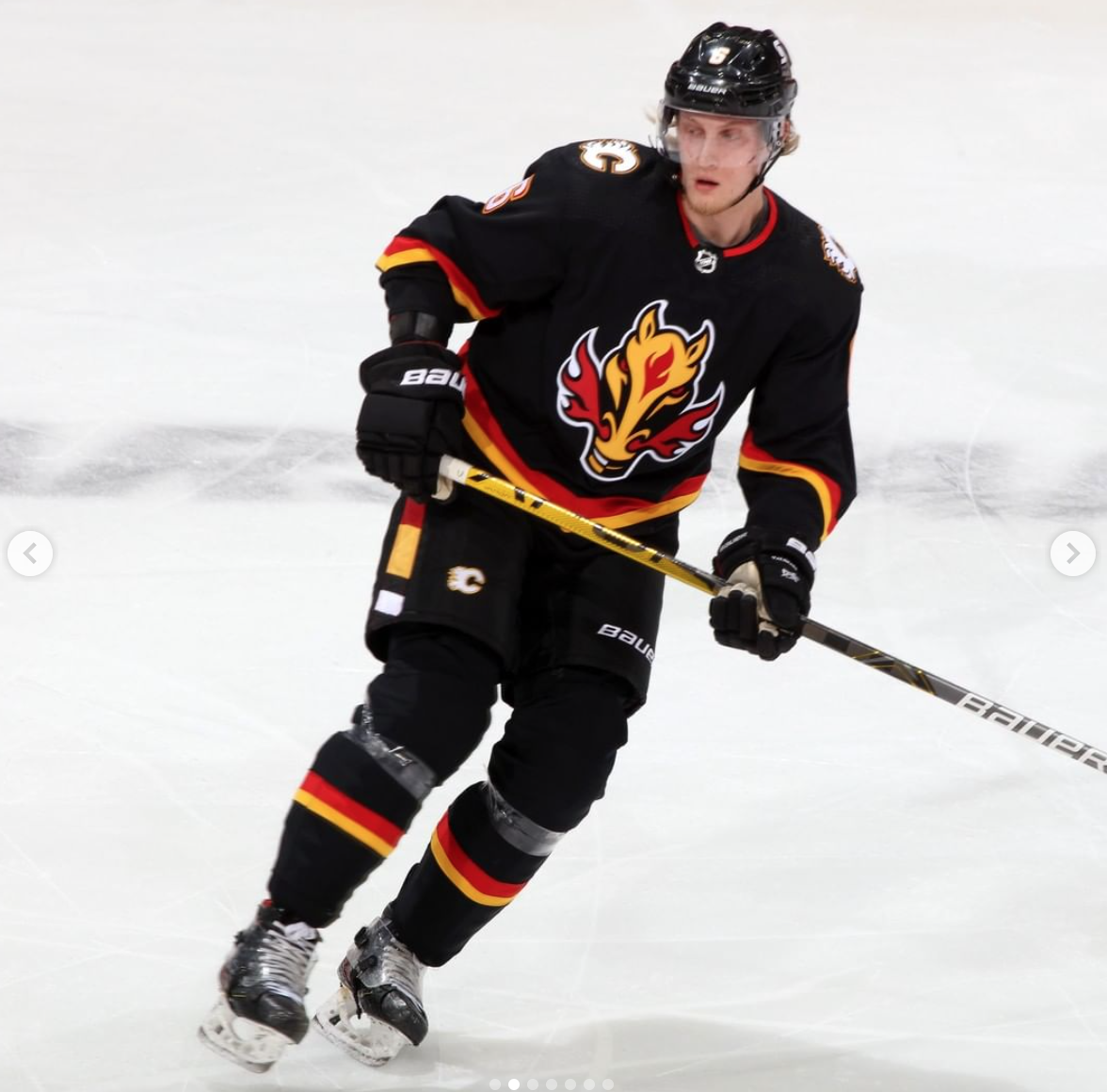

*Photos from @nhlflames on Instagram
These are phenomenal, and add to the Flames having one of the best jersey lineup in the NHL. These are a throwback to the "Blasty the Horse" jerseys from the 2000s, but these are much better than the original. The red and orange stripes really pop on the black jersey, and the white numbers look clean. I am a little torn on the logo, as I can't tell if I really like it or really hate it, but the whole design of the jersey, pants and socks is fantastic. Since the red and orange is subtle, the jerseys kind of look fully black from the main TV camera, but up close, they're great. I'm a huge fan of these.
5. New York Rangers


*Photos from @nyrangers on Instagram
I hate the Rangers, but I absolutely love these jerseys. These are inspired by the "Lady Liberty" look from the 90s, and they honestly made them even better. These are simple, but flawless. They honestly could not have made these jerseys any better. There is gray on the font, but that gets a pass on these because the gray was on the original version of these. They do look a bit bland on TV, since the stripes aren't that noticeable from the main TV camera, but close up, these are beautiful.
4. Arizona Coyotes


*Photos from @arizonacoyotes on Instagram
I love these jerseys. I think the purple looks amazing, and the desert design at the bottom adds a lot of character that most NHL jerseys lack. The Kachina logo is unique for sure, but I like it. These are a twist on their gross green third jerseys from the 90s, but these are so much better. I honestly don't know what else to say about these other than I think they hit these out of the park.
3. Florida Panthers


*Photos from @flapanthers on Instagram
Amazing. Absolutely beautiful. These pay homage to the team's original red jerseys from the 90s, but going blue was the right choice. The logo is fantastic, and they should have never ditched it for the awful soccer-esque logo they have now. The only thing I would change is I would add the broken stick to the Panther's hands, like seen here, just to add a hockey touch to it. Otherwise, this is flawless.
2. Washington Capitals
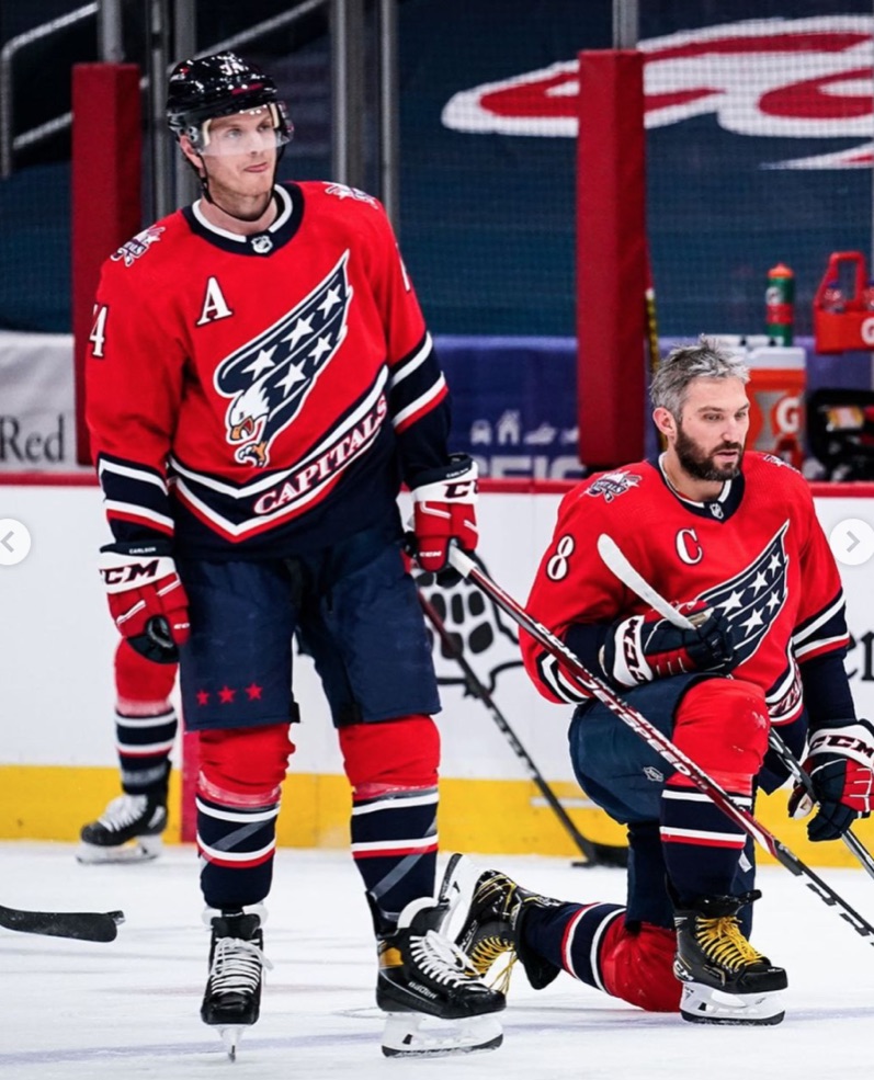

*Photos from @capitals on Instagram
Simply sensational. The Caps hit this out of the park. These pay homage to the "Screaming Eagle" jerseys the caps wore in the 90s and early 2000s, but add a modern twist by using the Caps current color scheme. The only downside, which is the same issue that the Flames and Rangers have, is that they don't look as good from the main TV camera angle. It's hard to see the striping, so the jerseys just look red. The font is also a bit ugly on numbers such as 2, 3, 8, and 9, but otherwise, these are spot on. The screaming eagle on the front is fierce, and looks great in navy and white. The Caps desperately need to ditch their current home and away jerseys that they've worn since 2007, and using these full time would be a great idea.
1. L.A. Kings


*Photos from @lakings on Instagram
The Kings did everything right with these jerseys, They also get extra points for paying homage to two jerseys of the past. The color scheme is inspired by the original jerseys of the team, and the logo and striping are taken from the Gretzky-era of the team in the 90s. These could not have been executed any better. I have zero complaints about these, and honestly, they should switch to these full time. 10/10.

| Saturday, 04/20/2024 | |
|
|
Lacrosse - Varsity Boys |
| vs. Forman School |
|
| L | 6-7 | |
|
|
Lacrosse - Varsity Girls |
| vs. Forman School |
|
| W | 18-1 | |
| Monday, 04/22/2024 | |
|
|
Tennis - Varsity Boys |
| vs. Kingswood-Oxford School |
|
| L | 1-8 | |
|
|
Baseball - Varsity Boys |
| vs. The Master's School |
|
|
Win (15-1) CHANGED: This event has changed.
|
|
|
|
Lacrosse - Varsity Girls |
| vs. Kingswood-Oxford School |
|
|
Loss (5-14) CHANGED: Date, location and time change
|
|